This looks extremely interesting. How’s it coming along? Looks like you’re only three pages away from finishing, right? 
Well, 2 pages plus the artwork for the center panel. The stall in production is due to both me and my artist friend getting insanely busy at work the past few weeks. Will pick it up again soon enough.
I’d apologize for the delay, but as I said in my original post, this is a hobby project, and I prefer to take my time. It’ll be done when it’s done.
By the way, am now working on a parchment-style border, akin to the other Burning Wheel supplement sheets. It’s gonna look really sweet.
Coming along.

Side by side.

Excellent work! 
You rock!
Thanks!
I’ll also publish a version without the paper graphic for those who want to skimp on printer ink, or just prefer the clean look. Shouldn’t be too printer intensive though, I think. There’s just a touch of color in there, and mostly very light greys.
 Almost done!
I just finished up both player cheat sheets tonight. They’re two of the pages of the GM screen that will be facing outward when propped on the table. The only page I have remaining to complete is the centerpiece that will display on the outside of the screen between the two player cheat sheets. My artist friend doesn’t seem like he’s interested in doing the artwork for me, so I’ll be doing it myself. I’m a decent artist, just a bit slow. Once I am finished the art for the centerpiece, which shouldn’t be too long from now as I have a holiday coming soon, I’ll compile everything into three different eleven-page documents:
[ol]
[li]“The Screeny” ~ The “best” version of the GM screen, with full-“color” antique page backgrounds, as seen above. Will take a fair amount of printer ink, but if you want to tackle a fun GM screen project, this one’s for you.
[/li]
[li]“The Cleany” ~ A “clean” version of the GM screen, sans background.
[/li]
[li]“The Clippy” ~ A clipboard version with a 3 cm top margin, sans background.
[/li][/ol]
I may or may not keep the silly names. ^^
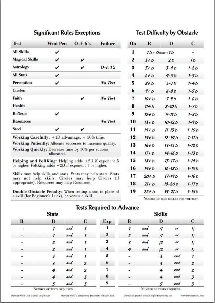
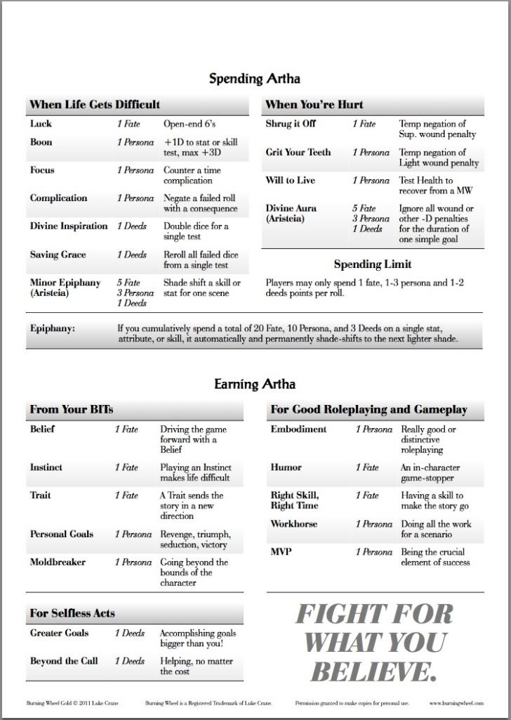
While you’re waiting, I’d like to hear your opinions on the two player cheat sheets, the “Clippy” versions of which are shown below. Anything you’d like to see changed? Note that the player sheets have a much larger font than the GM sheets: 12-pt. body font versus 9-pt. Very visible from across the table.
Thanks for all your patience!!! ~ Dean
You rock. The silly names are fine, after all, we’re gamers and we refuse to completely grow up.
You might want to put down that you can spend 1 Fate to reroll a failure on an open-ended test, too (Unless I’m missing it of course).
I’d kinda prefer a less ‘handwriting’-ish font for the first page, especially in the test difficulty by obstacle table.
Other than that, it all looks great, and I love the idea of the different styles
Ah jeez, I missed that! Thanks! And make that a double thanks, because I also missed that on the Artha section on the GM’s side of the screen. >.<
You’re right again! That font was something I was using on an old version of the GM screen back when I first started. Dunno why I went back and tried using it again. Slipped my notice, I guess. Will change it to match the fonts in the rest of the document.
Thanks for the input, much appreciated. ~ Dean
Happy to be of help